Wednesday, 17 April 2013

Integrated Theory and Practice (ITAP) 2: Cinematography

Question 1:

What is the role of the cinematographer in film making?

Answer:

The role of the cinematographer, in the broadest sense, is as the director’s main visual collaborator. They will use their expertise within the area’s of lighting, composition and photography to aid in both the shooting and the development of the film.


Question 2:

Why did director Roman Polanski insist on using handheld camera in the film "Chinatown"?

Answer:

Roman Polanski’s use of a hand-held camera during the shooting of the film was to induce a greater sense of intimacy and interaction between the audience and the actor’s.
It also made sense in the structure of the film, which is seen subjectively through the eye’s of Jack Nicholson’s character,  J.J. Gittes.

J.J. Gittes
Question 5:

Who is the cinematographer for the film Apocalypse Now, and what is his philosophy?

Answer:

The cinematographer who worked on “Apocalypse Now” was Vittorio Storaro, and his film philosophy is highly influenced by the Theory of Colours made famous by Johann Wolfgang von Goethe. It presents the idea that colours have a very specific effect on the viewers psychology and how this may alter their interpretation of a scene, or indeed the entire film in general.      

Vittorio Storaro


Integrated Theory and Practice (ITAP) 2: Samuel Taylor Wood

Question 2: 

How does the use of multi-screen installation in her work reflect narrative?

Answer: 

In the work of Samuel Taylor Wood, multi-screen is used to create the the depth of feeling and emotion in the subject, allowing the viewer to experience the movement, and subtle changes that life and death endures.

What is living is never a constant as what lives will always eventually die. The raw emotion is demonstrated through film displayed on a screen, while equally being enforced by still works.
The story, or present narrative is told by exposing the raw emotion and vulnerability of the subject; leaving the viewer to create their own narrative, taking from it what they will, whether it be on a purely superficial level, leaving it on just its face value, or interpreting and reflecting their own experiences and lifestyle.

The multiscreen allows the story to be told in an all consuming, all encompassing environment, giving the viewer time to enter the world crafted before them, and feel the depth of emotion felt. An example of one of these multi-screened narratives is found in her film “Third Party”, documenting the seemingly chaotic and subtle actions of a host of characters whose begin to intersect at a party.


Question 3:

What other photographers use film as an integral part of their work. list two with example?

Answer:

Two other photographers/film makers who use film as an integral part of their exhibition work and art in general are Eija-Liisa Atila of Finland, and Doug Aitken of California.

Eija-Lissa Atila

Doug Aitken
Eija utilizes the display of multiple screens and vantage points to focus on the construction  of her feminist narratives on traumatic experiences, through the use of image, language and space.

Doug’s work almost entirely encompasses the use of interior and exterior spaces to their full advantage, in brining out a full sense of emotion through the heavy use of coordinated visuals splashed along all flat surfaces, and original music conducted by friends and associates.


Question 5:

Show an example of a specific gallery space or a site specific location where a video artist or film maker has created work specifically for that space and been influenced by it.

Answer:

A good, clear example that would link to Samuel Taylor Wood’s interior film displays, would be the piece entitled “Rising” by Isabelle Hayeur. It shows a film that has been designed to appear like a continuous expansion of the hallway from which it is been placed, at the Denver International Airport.


Isabelle Hayeur


Thursday, 10 January 2013

5 Principle Study (9):Image and Text


Joel Sternfeld

In the Sternfelds work Walking the High Wire, he looks at an old train line that runs high above New York. This allows the viewer to see the untouched area above an increasingly developed scene below, giving New York a whole new virtually unseen perspective. With all the natural growth and environmental change in contrast to the concrete developments and industry of New York requires no words.   Some viewers assume the pictures are digitally enhanced,  but they are not, they are true images of the seasonal changes. With his work  the photograph and the title tell the story, covering subjects such as natural disasters, such as tornadoes and flooding, to mass numbers of beached whales, or areas of immense beauty. His subject area is diverse, but all enthralling and at times, shocking, but the message is quite evident.

John Hilliard

The english photographer John Hilliard uses the manipulation of the photograph to convey his message. What may be obvious in the original image, when taken out of context is not so cut and dried. He allows more than one perspective at a time and by making multiple exposures distorts the image of the constant subject. This makes the viewer question what is real.

Rene Magritte

Born in 1898, this painter went through many phases, influenced by Artists such as the cubist Metzinger to Renoir. His popularity rose in the 1960s, influencing the pop, minimalist, and conceptual art movements. His painting require no words, using familiar objects or subjects in surreal combination and positioning. “The Son of Man” is a bowler hated business man with an apple over his face, his eyes peeking over.  His left arm bends backwards at the elbow. It is explained as the conflict between what is hidden and what can be seen. His paintings seem to contain himself as a suited city gentleman of his time conveying his hidden message. 

Gillian Wearing

This english photographer/video artist uses her medium to display the inner turmoil/confessions of ordinary people in the street, through still photography and eventually through video, using actors to lip-synch the recordings of children's confessions, or masked individuals divulging their inner thoughts. The written words that the people display show the inner troubles and worries of some, and shows the viewer how we, at time stereotype people. Some images surprise, some amuse, some disturb.

Sophie Calle

This French photographer seems to be, in part, deceptive to the viewer. Her work looks to be genuine observational documentary photographs, but are in fact contrived by the artist and directed by her. They give the viewer the impression that they are intruding on the privacy of others or are collaborating in the violation of privacy, but it is almost a set up, questioning what is the truth or a lie.

Jim Goldberg

Jim Goldberg makes documentary films, often graphic documents of people on the bottom tier of life, in San Francisco, from illegal immigrants, refugees, drug addicts and asylum seekers. His work, tells a story in a snap shot video style, building to a full picture of, at time,  others enduring great hardship or trauma. He is best known for his work “Raised by Wolves” (1995), documenting ten years spent with young homeless people. His documentary storytelling speaks volumes without vocal narration, just the recorded vocals   and written witness accounts. This work seems voyeuristic but very powerful.


5 Principle Study (8): Production for Visual Communication


The Gutenberg Bible was the first major book printed in the 1450’s. The book was printed by Johannes Gutenberg in Mainz, Germany using the moveable type printing press, marking the start of the age of the printed book.
The bible was printed in black letter type  known as Textualis and Schwabacher. 
The hand written manuscripts were produced using water-based inks, but Gutenberg used oil-based ink with high levels of carbon and metals (copper,lead, and titanium).
This enabled the ink to adhere to the metal type.
Gutenberg used quality paper, made in Italy, which had a watermark running through it that was made by paper mold. Gutenberg’s first process required the paper to be passed twice through the press using black and then red ink (rubrication-latin rubrico to colour red).
This rubrication was used to emphasize the words. This was soon stopped in the printing , allowing any red emphasis to be added by hand.


The basis of this new technology was shafts of metal, with letters of the alphabet on the end that were movable.
Problems arose due to the type had to be exact so that the surface of the pages would come out identical. The process became easier when better quality inks became available that would adhere more efficiently to the metal type.
Within ten years of the Gutenberg’s production, this type of printing was being used all over Europe as well as in area’s of the New World.


My favorite expert within the broad field of animation and general film direction would be the screenwriter/director Hayao Miyazaki.
Born in 1941, this japanese artist/mangaka/animator’s career, has grown extensively across the span of 50 years, within that time he has shown a developed and highly distinctive vision for his work,refined within the various employee roles to be found in the business of animation production; all the while continuing to gather national and international acclaim from the directors seat.
With the founding of Studio Ghibli in the 1980’s, Miyazaki directed a whole series of features that went down successfully with the Japanese movie market, but were only now starting to grab the attention of the Western world. It would not have likely have developed any further than within the borders of Japan, had it not been for the production of one of Miyazaki’s most acclaimed movies, behind Spirited Away(2001, which would go on to be the first animated film from any country in the world to win an Academy Award), Princess Mononoke(1997). This film helped Miyazaki gain a foothold within the international movie market.
With the history aside, the reason why i see Miyazaki as my ‘favorite’ expert, is because he has always maintained a specific vision for the way his work should or should not be portrayed. Japan’s film industry is built upon giant manga and anime industry rivals, but he has worked his way up through the ranks and various specialities and all the while never losing focus of his principles and aims. His work is, to me like a moving painting, always within his own recognizable style. He is an expert in achieving his vision and isn’t afraid to challenge the preconceptions of what is expected of Anime.


Sunday, 6 January 2013

5 Principle Study (7):Production and Outcomes


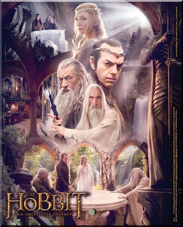
For this Principle (Interpretation), I will be looking at the varying visualizations of the Hobbit, comparing the original 1946 illustrations by Tolkien himself; and what material imagery is produced in this present age, for the latest incarnation of the tale for film, directed by Peter Jackson.


Tolkien’s image presented here, and in general with the rest of his illustrated piece’s, showcase the need to give only a vague sense of the overall scene, focusing more strongly on providing the general features and atmosphere. This usually only includes an idea of the environment, e.g: forests, buildings, interiors; leaving the interpretation of the main cast of characters up to the reader to deduce from within their own wild imaginations.
This particular method would only be properly effective, within the form of novelization; that if formulated from an alternative platform present at the time of publication, such as commercialized branding or a full description-heavy illustration, would lack the main essential narrative context needed to ignite the viewers mind, on what they believed things within Tolkien’s world should or should not appear to be, giving them a sense of instant gratification.
The popular illustration and graphic movement at the time would have been that of Art Nouveau, given the stylistic approach to his visualized landscapes, and the use of stark, almost monotone colour palettes, inspired by artists like Aubrey Beardsley and Hugh Lofting, as well as borrowing techniques from artist Jennie Harbour, for the more narrative scene descriptions.


The latest promotional material created for the newest incarnation of “The Hobbit”, directed by Peter Jackson, approaches the depiction of the world’s setting and its inhabitants far differently than what would have been wished for by the author; by creating a permanent, fixed one-sided idea of what the landscapes and characters should appear as to the viewers, via promotional material such as this poster. It takes away the overall aura, left initially by their empty slot in the mind of the person, which would be left to them to fill in a manner that is unique to them. This method of visualizing the world and its subjects for film, on a grand and epic scale suited to the genre of fantasy, and used as a tactic to sell seats at the cinema. This came into prominence  around the emergence of the original Star Wars trilogy, back in the late 70’s, which showed that epic scifi/fantasy could succeed at the box office.


An excellent example of an Animator/Illustrator who uses varying mediums to promote and represent themselves, would be Matthieu Bessudo, better known as Mcbess.
His general motto for the direction his career has led him, has always been one that lets him be in control of every single aspect of it; whether that be in illustration, animation or music.
After first rising to fame and popular interest from his involvement in Sigg Jones, a short 3D animated film, his surrealist illustrations and unique characters, contain exquisite amounts of detail. He also makes up one quarter of the band ‘The Dead Pirates‘ for whom he sings, plays guitar, designs merchandise and makes their music video’s.    


Saturday, 5 January 2013

5 Principle Study (6): Three Act Structure


The process of compiling a story using the Three Act Structure, seemed to be an extension of the Beginning, Middle and End, but made out of a more constructive form or like a sinus rhythm of the heart beat.
The way that this principle structure is likened to this analogy is through its procedure of development through progression. It starts slow; increasing in strength and becoming more forceful, before finally peaking and settling down from fulfilling its purpose of reaching a fitting conclusion.
Many of my illustrative work is structured in a manner that can be seen as having a coherent beginning, middle and end, purely from the way the eye views the lines of the illustration’s central features, and its included surrounding elements (if they are present).

For a similar example in film, i’ll again use my stop-motion animation done in college, “Gastropod” where a classic use of the Three Act Structure is implemented.
The general plot and set-up, follows a quite stereotypical frenchman, playing the role of the gardener, as he becomes displeased with a group of snails, and 1 lonely slug, snooping around inside his greenhouse. The Inciting Incident is introduced when the lead snail’s girlfriend is eaten by the gardener, giving the remaining snail great grief and inciting revenge!.

After that, the snail and slug escape from the greenhouse, while from inside the gardener tries out a special type of seed thats manages to make his vegetables grow to twice their original size (tested on 2 pumpkin’s). The Rising Action starts to take hold when the gardener goes to collect some more seeds from the sack outside. As he pours them into his bucket, some fall out onto the ground, where the snail and slug are cautiously watching, witness from around the corner. The action continues to rise as the two characters approach a cluster of fallen seeds, when the lead proceeds to eat one.
Once eaten the lead snails begins to act up, causing the slug to panic and flee. As the snail struggles onward away from the greenhouse, this is where we hit the Climax of the film, the transformation from tiny snail, to one twice the size of the greenhouse.
We then come to the Falling Action, where the gardener, contempt with his gigantic vegetables, fails to see the danger he is in until the last moment, where he is eaten up within his greenhouse by his own accidental creation. The final resolution comes as the giant snail looks onward towards the viewer for the last few frames on film, inciting those viewing to make judgement on what has occurred.

For an example of work involving Narrative Techniques in Context, i’ll also once again showcase the themes and setting for my character Tippett within the short trailer/film “Dreaming Conundrum”.
Though it may seem as though Tippett is in some sort of nonsensical navigation of equally nonsensical dream landscape; There is context within the features show in each dreamscape, as the purpose of the narrative was to have Tippett travel through the dream accounts that people, made up of friends and associates, had actually had, and had some sort of profound meaning specifically to them and them alone.


These shots from the short promotional trailer were not constructed out at random, but were based upon descriptions of dream events; which were then given to me to piece together in a way that seemed intriguing. 


Though the dreams of each person may not link to each other solely by themselves, a useful narrative strand was created with the introduction of Tippett, who is the main feature linking each dreamscape together.


Sunday, 11 November 2012

5 Principle Study (5): The Design Process


The two principles that I see as my standard approach methods when beginning the design process, out of the 5 present, would be Principle 3: Research the Practice, and Principle 5: Visual Hierarchy.
The reason for these two being picked was because I don’t particularly see myself as someone who goes massively in-depth on a certain content, at least not to the extent that it would take over all my work-related occupations. I much rather just develop the particular visual flair for the project, and then find or include the useful content that is relevant in the conveyance of the message or theme.

The reasoning for Visual Hierarchy is simple, its important to make elements of your scene/character/environment, visually attractive to the human eye so that the audience can correctly understand and follow the features and colour/design scheme of your work. This can apply to two quite different approaches and professions of visual communication; for example, the colour palette of the look and feel of an illustrated character is important for drawing in the viewer to specific elements of a character, such the head or upper body area, and from there, allow for an easy-to-follow course of direction for the eyes to take, in order for them to get the full picture of who the character is as an individual (e.g: a sense of their personality, or traits).
This also similarly to colour palettes within the area of market labeling for a supermarket, as having a distinct, but more neutral colour choice to aid in distinguish labeling from the continuos repetition of the primary colours found on the packaging of food and good.

Main Character from final year project at college. The viewers eye may be drawn to the enlarged head and neck collar feature, which leads to the varied costumes he is wearing.

For the research into practice, I found recent inspiration for the illustration approach to the Birmingham City magazine project, from the stylings of cartoonist and illustrator John Holmstrom. The vibrant, hard edged, jagged style of his work, on ‘Punk‘ in particular was highly influential in the popularization of the music scene magazine, as well as illustrative magazines to not be constrained within just the comics genre.

Using the primary media of Strathmore Bristol paper, pen, ink and overlays used for colour, Holmstrom had used these tools to create commissioned artwork for underground bands and magazines under very short deadline periods. The most recognized of these probably being his album cover for the band Ramones ‘Road to Ruin‘, in which he had only a day to complete the commission.

Album Cover

Issue 1. of Punk magazine
On the side of Visual Hierarchy, there were many example of hierarchy that both worked and didn’t that I was drawn to, within unusual ad designs and campaigns.
Most of these do require some kind of forward slogan or a statement to make more sense, but given a bit of time to look at them, gives the viewer the chance to piece together what is trying to be conveyed, either by the suggested imagery or the general colour palette.

Example of lack of hierarchy. as the colours have been matched to create an atmosphere and mood, it loses the ability to convey the main message, originally meant to seem obvious to the viewer.


Advert for the drink Absolut, though caption is required for knowing the brand, its the image itself that helps bring the separate elements together into a whole. Visual hierarchy that works. 

Same goes for this advert, also for Absolut.