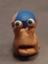
The two principles that I see as my standard approach methods when beginning the design process, out of the 5 present, would be Principle 3: Research the Practice, and Principle 5: Visual Hierarchy.
The reason for these two being picked was because I don’t particularly see myself as someone who goes massively in-depth on a certain content, at least not to the extent that it would take over all my work-related occupations. I much rather just develop the particular visual flair for the project, and then find or include the useful content that is relevant in the conveyance of the message or theme.
The reasoning for Visual Hierarchy is simple, its important to make elements of your scene/character/environment, visually attractive to the human eye so that the audience can correctly understand and follow the features and colour/design scheme of your work. This can apply to two quite different approaches and professions of visual communication; for example, the colour palette of the look and feel of an illustrated character is important for drawing in the viewer to specific elements of a character, such the head or upper body area, and from there, allow for an easy-to-follow course of direction for the eyes to take, in order for them to get the full picture of who the character is as an individual (e.g: a sense of their personality, or traits).
This also similarly to colour palettes within the area of market labeling for a supermarket, as having a distinct, but more neutral colour choice to aid in distinguish labeling from the continuos repetition of the primary colours found on the packaging of food and good.
 |
| Main Character from final year project at college. The viewers eye may be drawn to the enlarged head and neck collar feature, which leads to the varied costumes he is wearing. |
For the research into practice, I found recent inspiration for the illustration approach to the Birmingham City magazine project, from the stylings of cartoonist and illustrator John Holmstrom. The vibrant, hard edged, jagged style of his work, on ‘Punk‘ in particular was highly influential in the popularization of the music scene magazine, as well as illustrative magazines to not be constrained within just the comics genre.
Using the primary media of Strathmore Bristol paper, pen, ink and overlays used for colour, Holmstrom had used these tools to create commissioned artwork for underground bands and magazines under very short deadline periods. The most recognized of these probably being his album cover for the band Ramones ‘Road to Ruin‘, in which he had only a day to complete the commission.
 |
| Album Cover |
 |
| Issue 1. of Punk magazine |
On the side of Visual Hierarchy, there were many example of hierarchy that both worked and didn’t that I was drawn to, within unusual ad designs and campaigns.
Most of these do require some kind of forward slogan or a statement to make more sense, but given a bit of time to look at them, gives the viewer the chance to piece together what is trying to be conveyed, either by the suggested imagery or the general colour palette.
 |
| Example of lack of hierarchy. as the colours have been matched to create an atmosphere and mood, it loses the ability to convey the main message, originally meant to seem obvious to the viewer. |
 |
| Advert for the drink Absolut, though caption is required for knowing the brand, its the image itself that helps bring the separate elements together into a whole. Visual hierarchy that works. |
 |
| Same goes for this advert, also for Absolut. |


